PrimeGrip AI · Debi Group
A fintech platform for valuing a business
PrimeGrip AI tells business owners what their company is worth and how to raise it. I designed it end to end, together with its landing page, the Debi Group website and one design system for all three.
- Product design
- Design system
- AI-native workflow
- Fintech SaaS
 Debi AI
OverviewValuations
M
Done
All the required data is in. You can start the report now, or add more data to make it more accurate.
What I designed
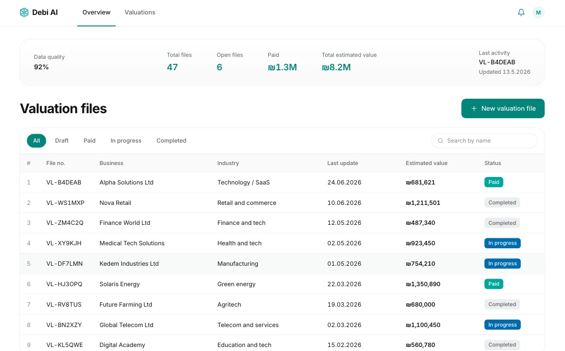 PrimeGrip AI platformResearch, flows, every screen, desktop and mobile
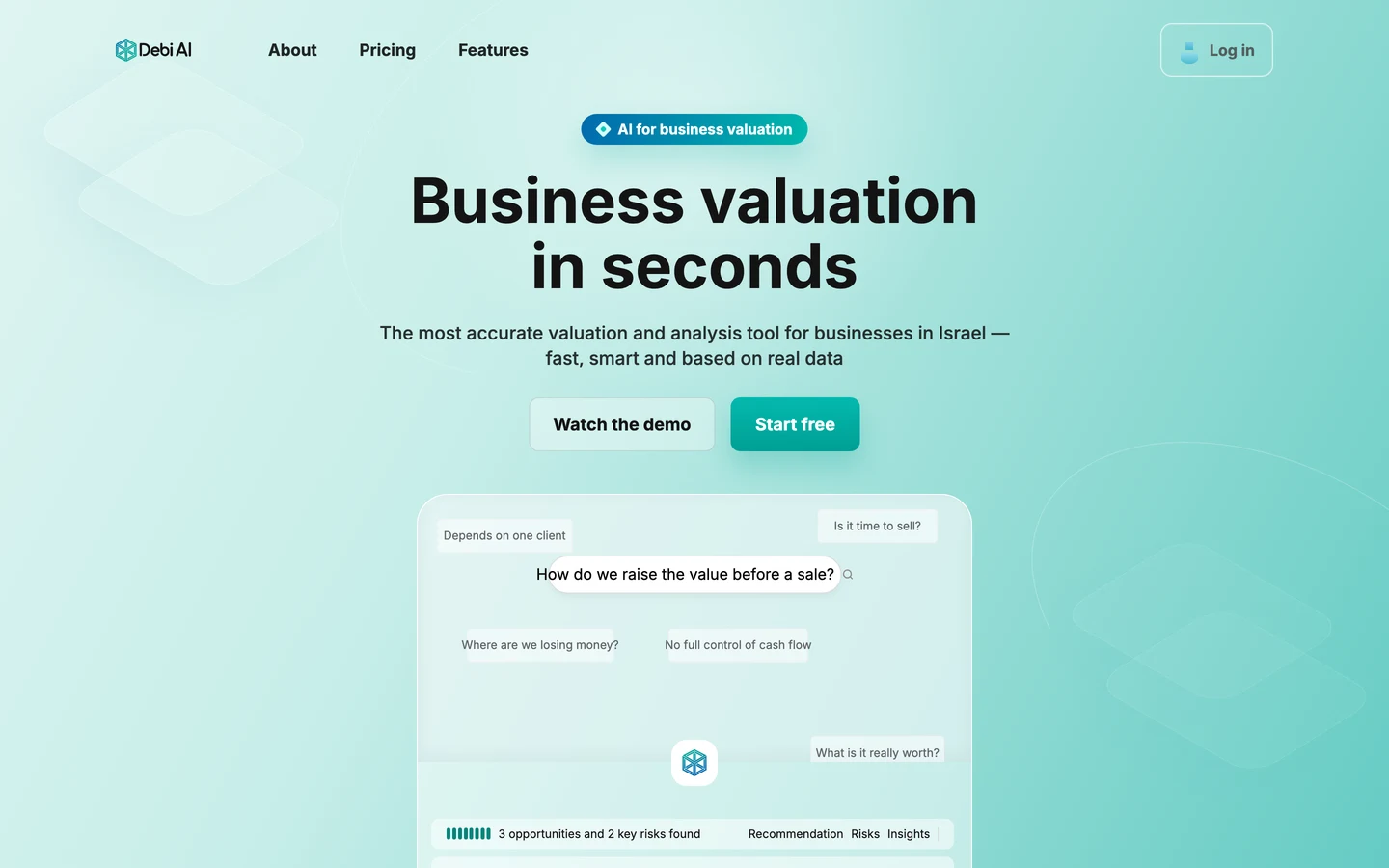 PrimeGrip AI landing pageThe story, the hero visual and pricing
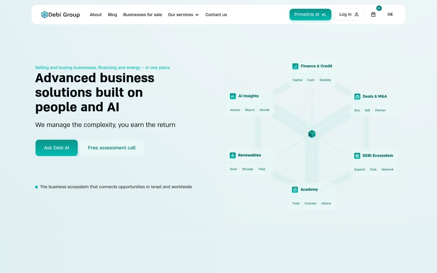 Debi Group websiteSix services, motion, code prototypes, Hebrew and English
- Role
- Product designer, UX/UI
- Client
- Debi Group, Israel
- Year
- 2026
- Status
- Live
01 · Context
Owners sell a business once. Buyers do it every week.
Debi Group helps Israeli business owners finance, buy and sell companies. Every deal starts with one question, what the business is worth, and today the answer is an analyst’s spreadsheet.
- Product brief
- User types
- Fintech
- M&A
Five users in the brief I wrote
- SellerThe price, and how to raise it
- Buyer or investorThe risks before paying
- BorrowerA report a bank accepts
- AdvisorValuations for clients
- Franchise HQBranches side by side
02 · Research
Five rules from finance and trading apps
Before drawing screens, I studied how trading apps, valuation services and investment banks show money to people who don’t work with it. The review shaped the whole product: the form, the report and the landing page. I wrote it down as five rules. The report is where all five meet.
- UX research
- Competitive analysis
- Information hierarchy
- Content design
ReviewedeToro, Bridgewise, ValueBase, Forge Global, Morgan Stanley, J.P. Morgan, Goldman Sachs, Insight Partners
Debi AI
OverviewValuations
M
Improving your debt-to-equity ratio would let you raise ₪1.5M.
See how03 · Ecosystem
Three products on one client journey
An owner meets Debi on the group website, learns what PrimeGrip AI does on its landing page and values the company on the platform. The report then leads back to the group: to financing for a loan, to the M&A team for a sale. I designed all three, so the journey looks and works as one.
- User journey
- Service design
- Cross-product UX
Debi Group website
Where the owner meets the group: finance and credit, deals and M&A, the business academy, renewable energy and the business ecosystem, which includes PrimeGrip AI.
What I designed
- Information architecture
- Motion
- Code prototypes
- Hebrew and English
PrimeGrip AI landing page
Shows which questions PrimeGrip AI answers and what it costs, then sends the owner to start free or to watch the demo.
What I designed
- Value story
- Hero visual
- Product flow animation
- Pricing
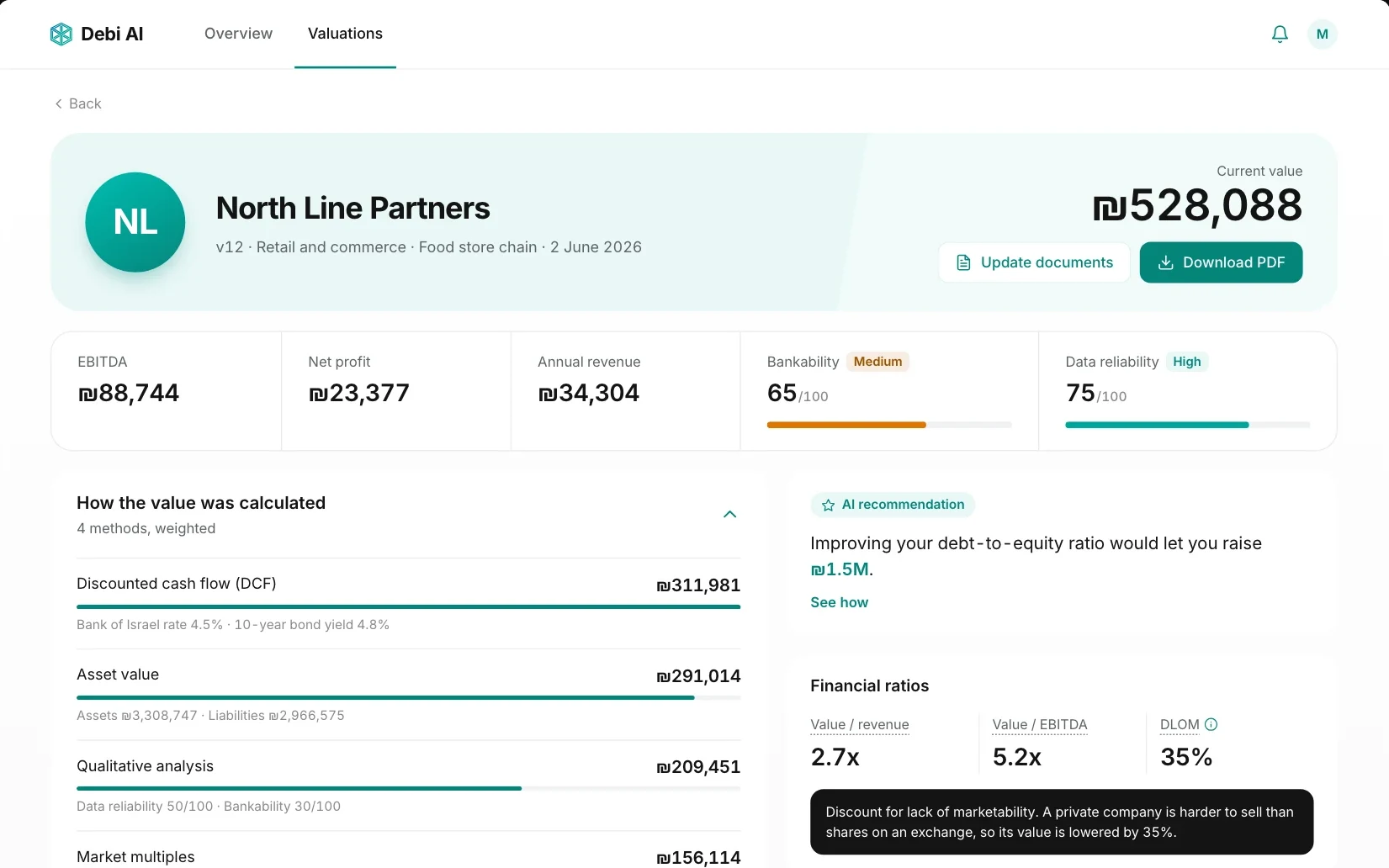
PrimeGrip AI platform
The owner fills in the form, gets the report and downloads it as a PDF for a bank or a buyer. That is where the group’s finance and M&A teams come back in.
What I designed
- Dashboard
- Form flow
- Report
- Desktop and mobile
04 · Flow
One path from sign-up to a ready report
Before drawing screens, I mapped the platform: the main path an owner takes, every place they might stop, skip or go back, and how a file is found again. Each branch got its own control in the interface, so the form never becomes a dead end.
- User flows
- Information architecture
- Edge cases
- Save and resume
- Start
- Website or landing
- Sign up
- Valuation files
- Fill inSave and exit on every step, back to Valuation files as a draft
- Business details
- FinancialsSkip the optional straight to Documents
- More detail
- DocumentsUpload later on to Ready, the file is marked
- ReadyEdit a part back to any step
- Get the value
- ReportUpdate documents back to Documents
- PDF for a bank or buyer
- Save and exitAny step → Valuation filesThe file waits on the list as a draft, so the owner can stop and come back with the papers.
- Skip the optionalFinancials → DocumentsThe questions on screen 3 can wait. A note says they make the value more accurate.
- Upload laterDocuments → ReadyA missing report doesn’t block the form. It’s marked, and the summary lists what’s left.
- Edit a partReady → any stepThe summary lists the four parts with an edit link each, so a fix never means starting over.
- Update documentsReport → DocumentsMore documents raise the data-reliability score next to the value and refine the value itself.
Platform mapOverview · Valuations › valuation file › form or report › PDF
05 · Product
Five phone screens from first field to report
The report is only as good as the owner’s data: business details, about 24 financial questions and three years of reports. On a laptop that is a four-step form; on a phone I split the questionnaire in two, so each screen holds one topic. Every screen shows progress, keeps the buttons in reach and saves on exit, so the owner can stop and come back with the papers.
- Mobile-first forms
- Progressive disclosure
- Design decisions
- RTL and LTR
Scroll or drag inside a phone to see the rest of the screen
Decisions behind the screens
- Two questionnaire screens on a phoneOne screen with 24 fieldsOn a laptop the questionnaire is one step. On a phone that is a long scroll with no sense of progress, so I split it by topic and put the optional questions on the second screen.
- Upload later, not a blocked stepContinue only when every file is inOwners rarely have three years of reports at hand. A missing file is marked, and the summary shows what’s left.
- Buttons that never scroll awayButtons at the end of a long formSave and exit and Continue stay pinned above the home bar on every screen, so the owner can always stop safely.
- AI output that shows its footingAn unlabelled tipThe recommendation is marked as AI, says what it’s worth in shekels and links to how. A data-reliability score sits next to the value, and more documents raise it.
06 · Design system
One token set for three products
Before the system, two platform screens alone used 37 colour values, many of them near-copies of the same green or grey. I rebuilt colour, type, corners and shadows as Figma variables that the platform, the landing page and the website share.
- Design tokens
- Figma variables
- WCAG AA
- Theming
39 primitives under 101 role tokens
A primitive is a raw colour. A role token says what it paints: a button, a text, a border, a chart. Screens use only the roles, so a shade changes in one place and every product follows. Pick a colour to see what it paints.
- Green
- Neutral
- Blue
- Orange
- Red
Green/600 7 roles
- Text/Brand
- Border/Brand
- Brand/Primary
- Action/Primary/Bg
- Action/Ghost/Text
- Chart/Brand/Primary
- Chart/Green/1
Action green, one step darker. White text on it is 4.52:1, so every primary button uses it.
Text by size and weight
Display and heading styles carry the hierarchy and get smaller on a phone. Interface text is one matrix of six sizes and three weights, named by size rather than by role, and it is the same on both. The product font is Almoni; here the styles are set in Inter.
Text/M/Regular · 16/24
- Display/XL72/7248/56₪528,088
- Display/L60/6040/48₪311,981
- Heading/XL48/4836/48North Line
- Heading/L36/4032/40Valuation files
- Heading/M32/3232/32Financial data
- Heading/S24/3220/28Required documents
- Heading/XS18/2416/22Financial ratios
Text styles, the same on desktop and mobile
Where the products differ
Colour, type and spacing are the same everywhere. Corners, shadows and surfaces are not: the platform is a work tool, so it stays dense and mostly flat; the landing page and the website sell, so they get pill buttons, glass and softer shadows. Switch to compare.
- Card corner
- radius/16radius/32
- Buttons
- radius/12radius/full
- Shadow
- Platform card, 0 4 20 · 8%Landing soft, 0 4 8 · 5%
- Surface
- Flat, with a borderGlass on the landing gradient
- Colour, type, spacing
- The same tokens
07 · AI workflow
Agentic design workflow
I set the agents up as a system: which model or tool takes which job, what context they read and where a script is safer than a prompt. Every task runs one loop, and the decisions stay with me.
- AI agents
- Prototyping in code
- Context engineering
- Skills
- Automation
Every task runs one loop
- Set the task
- Plan
- Approve
- Run with tools
- Check
- Review
MeAgent
Lessons go back into the project rules, skills and the decision log, so the next task starts from them.
ToolsClaude Code · Codex · Figma MCP and Plugin API · Playwright · Remotion
How I set the agents up
- A model for each jobLanguage models for plans, code and Figma, an image model for photos, and no model where the result must be exact.
- Scripts for exact workWhat repeats or must match to the pixel runs as a script the agent writes once, not as a prompt run again.
- Context in filesAgents read the project, not my memory: rules, a facts file with check dates and a decision log with reasons.
- Plans with checkpointsA bigger task starts as a written plan of small steps, each with a check. Nothing runs before I approve it.
- Skills from repeat workWork I’ve done twice becomes a skill: design rules, typography tokens, Figma to video, screenshot QA. It loads only when a task needs it.
- Split or keep togetherIndependent pages run in parallel sessions. Decisions that need the whole picture stay in one place.
- GuardrailsClient Figma files are read-only, paid generative tools stay off, and nothing touches DNS or production without my approval.
- Machines check, I judgeScripts catch overflow, size jumps, hanging words and contrast. Taste, brand and wording stay with me.
Point at a card to see where it happened in this project.
What didn’t work, and what I did instead
- An image model for the logoIt redrew the Debi mark and its lettering. The photo kept the model’s wall; the logo on it is the exact file, placed by a script.
- A generated photo for the Energy heroStatic, in the reference’s palette and heavier. The sphere became a 3D mesh in code: one SVG and a 4 KB script, sharp at any size, coloured by the tokens.
- Two sessions, two schemesA page built in a parallel session placed its decoration another way. Before handoff, all four pages were brought back to one scheme.
I prototyped the website changes in code. Each page starts as a snapshot of the live site, and every change uses the theme’s own markup, so the developer applies it one to one. English builds from the same code.
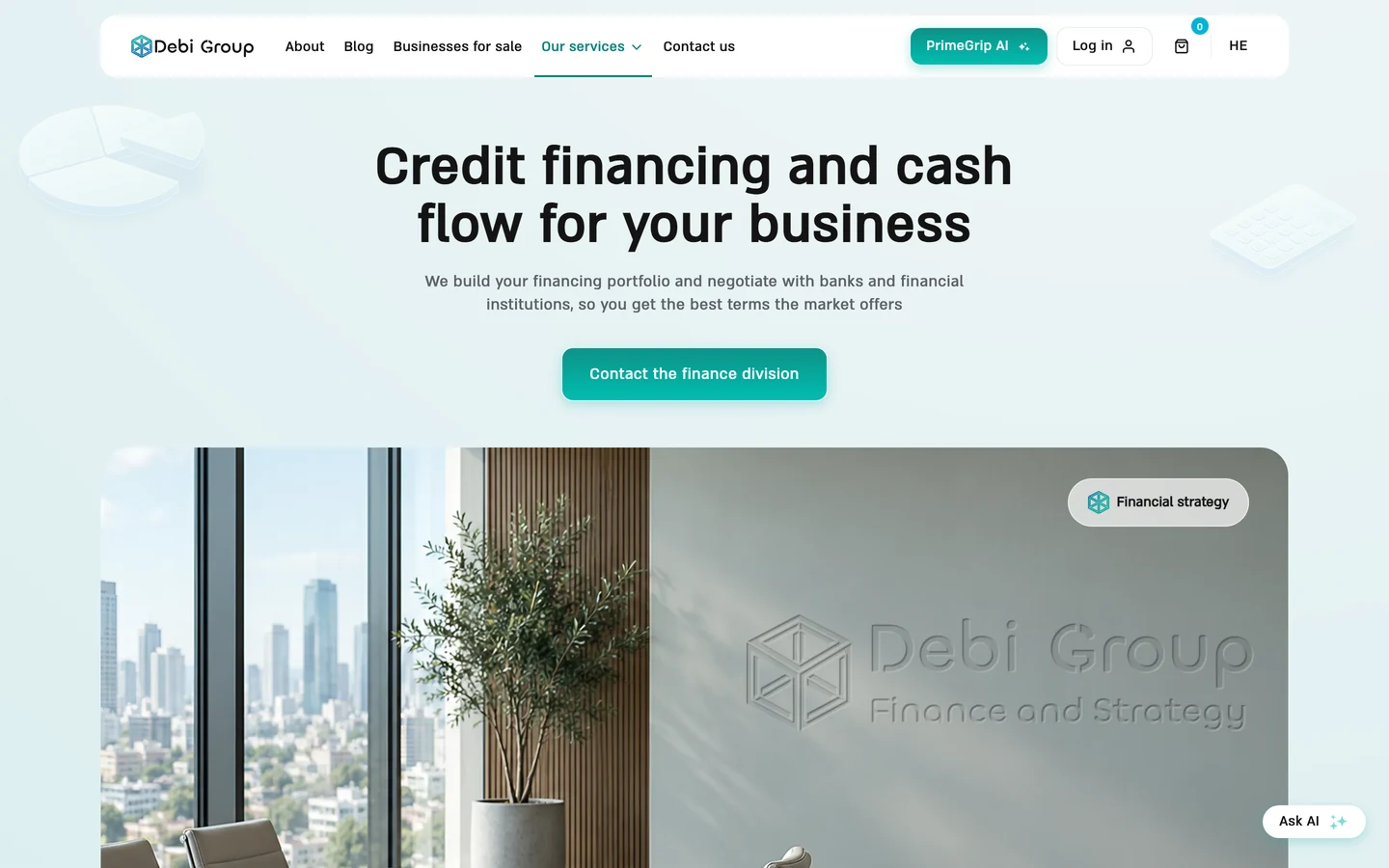
The Finance page prototype in English. The logo on the wall is the exact file, placed by a script.
- Setup
- A snapshot script for the live pages
- A coding agent for the build, my review for every change
- One English string file per page
- Result
- Seven pages in Hebrew and English, with motion and real content
- One handoff package per change, with markup and CSS
- The client reviewed the pages in the browser
I designed the token architecture and approved the plan step by step. The variables, text styles and documentation pages were then written into Figma over MCP.
The plan I reviewed, shortened
Goal: a v1 Figma-only colour
variable system for the Debi UI.

Task 1  Create colour primitives
  1. Collection: Colors
  2. One mode: Light
  3. Primitive/* colour variables
  4. Primitive scopes: empty
  5. Code syntax: var(--color-…)

Task 2  Semantic and scoped aliases
What landed in Figma
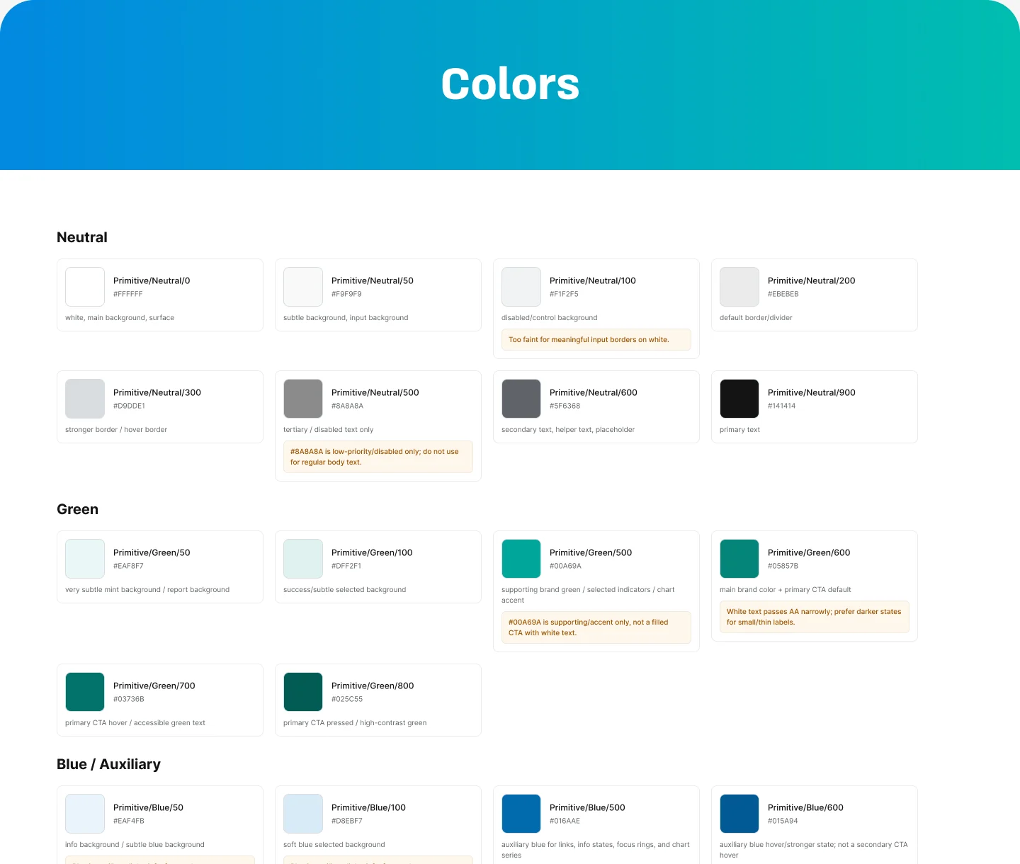
- Setup
- Skill:
typography-tokens - Figma MCP and the Plugin API
- A step-by-step plan, reviewed before each run
- Skill:
- Result
- Colour variables and text styles in Figma
- A documentation page for each group
- The same tokens in CSS for the website
The product flow started as a video. I rebuilt it as code: Figma screens to Remotion, then HTML, SVG and JavaScript with a small API for the developer. What plays below is that code.
- Setup
- Skill:
figma-remotion-video - Remotion for timing and rendering
- Plain HTML, CSS, SVG and JavaScript for the web
- Skill:
- Result
- Sharp at any width, lighter than the video
- Play, pause and restart for the developer
- Stops off screen, respects reduced motion
I set up a mirror-and-dictionary pipeline that turned the Hebrew website into English frames in Figma, page by page and width by width.
Numbers, logos and the phone layout keep their order; text, navigation and arrows turn around.
- Setup
- Skill:
debi-design - Mirror and sync scripts for Figma
- One shared dictionary
- Skill:
- Result
- Seven pages in English at 1440, 768 and 390
- Each frame checked against its Hebrew source
08 · Outcome
Live, consistent and handed over
There are no product metrics yet, so here is what shipped, what the developer got and how I would measure it.
- Shipped
- Bilingual
- Developer handoff
- Design QA
- All three live
The platform, its landing page and the group website, on one design system.
app.debi-group.co.ildebi-group.co.il - Bilingual
Hebrew and English from the same components and tokens, right to left and left to right.
- Developer handoff
Written in English, so the developer and any coding agent can apply it directly.
- Tokens
- CSS variables with the same names as in Figma
- Specs
- A package per change: theme file, breakpoints, markup and CSS
- Motion
- The hero as one animated SVG, the product flow as a code package
- QA
- Live pages checked against Figma at every width
- Time to find the value, goal 10 s
- Form completion
- PDF downloads
- Demo bookings
Ship the English website, design the reader modes for the five users in the brief, and test the report with business owners.
Takeaways
- 01Map the branches before the screensSave and exit, upload later and the edit links made the form finishable.
- 02Share tokens, not looksColour, type and spacing are shared; corners and shadows may differ.
- 03Agents need a system around themRules, a facts file, plans and checks did more for quality than any single prompt.